> ## Documentation Index
> Fetch the complete documentation index at: https://docs.frankieone.com/llms.txt
> Use this file to discover all available pages before exploring further.
# Result
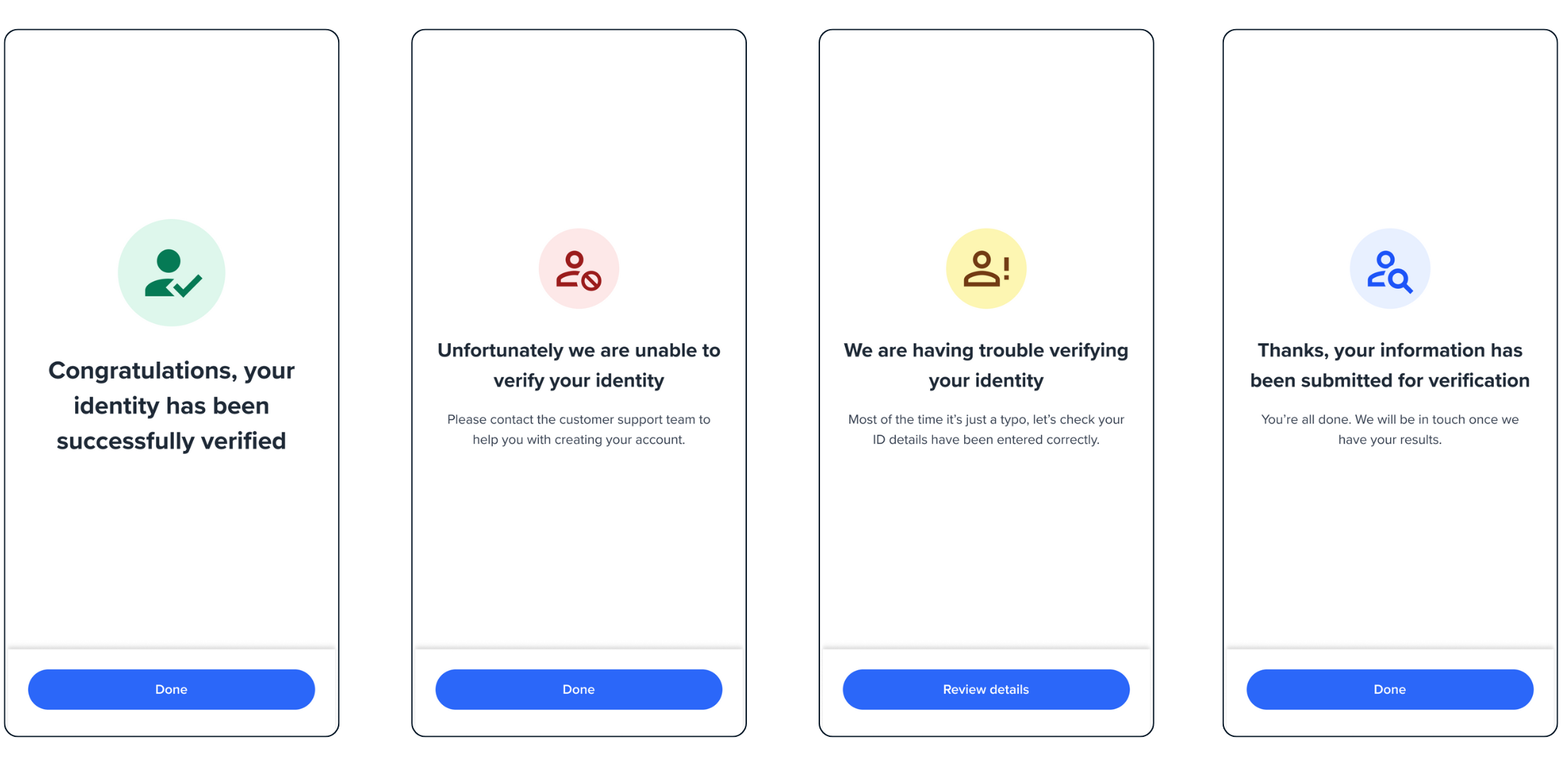
The Result screen is a versatile component that displays outcome messages at any point in your onboarding flow. It handles both success and failure scenarios, and can be embedded anywhere in your application.
## Available Result Types
Displays when a process completes successfully
Shows when an operation encounters an error
Indicates when some criteria are met but others aren't
Represents operations that are still in progress
 ## Quick Start
```html theme={null}
```
```javascript theme={null}
const result = oneSdk.component("form", {
name: "RESULT",
type: "manual",
state: "SUCCESS",
title: { label: "Complete" },
descriptions: [{ label: "Process is now complete. You can close the page" }],
cta: { label: "Done" },
});
```
```javascript theme={null}
result.mount("#form");
```
## Configuration Options
```typescript theme={null}
interface ResultConfig {
name: "RESULT"; // Screen identifier
type: "manual"; // Flow type
state: ResultState; // Screen state
title: TitleConfig; // Title configuration
descriptions: Description[]; // Description array
cta: CTAConfig; // Call-to-action button
}
```
```typescript theme={null}
type ResultState = | "SUCCESS" /* Success completion */
| "FAIL" /* Operation failed */
| "PARTIAL" /* Partial match */
| "PENDING"; /* In progress */
```
```typescript theme={null}
interface TitleConfig {
label: string;
style?: "ff-title";
}
```
```typescript theme={null}
interface Description {
label: string;
style?: "ff-description";
}
```
```typescript theme={null}
interface CTAConfig {
label: string;
style?: "ff-button";
}
```
## Event Handling
```javascript Listen for Result Events theme={null}
// Component loaded
oneSdk.on('form:result:loaded', () => {
console.log('Result screen loaded');
});
// Success button clicked
oneSdk.on('form:result:success', () => {
console.log('Success action triggered');
});
// Failure button clicked
oneSdk.on('form:result:failed', () => {
console.log('Failure action triggered');
});
```
| Event Name | Description |
| :-------------------- | :--------------------------------------- |
| `form:result:loaded` | Emitted when screen loads |
| `form:result:success` | Triggered on success screen button click |
| `form:result:failed` | Triggered on fail screen button click |
| `form:result:partial` | Triggered on partial match button click |
| `form:result:pending` | Triggered on pending screen button click |
## Styling Guide
```css theme={null}
.ff-title {
/* custom css */
}
```
```css theme={null}
.ff-subtitle {
/* custom css */
}
```
```css theme={null}
.ff-description {
/* custom css */
}
```
```css theme={null}
.ff-logo {
/* custom css */
}
```
##### Styling Best Practices
* Use CSS classes for consistent styling across all result screens
* Override specific styles using the configuration object when needed
* Keep styling consistent with your application’s theme
## Quick Start
```html theme={null}
```
```javascript theme={null}
const result = oneSdk.component("form", {
name: "RESULT",
type: "manual",
state: "SUCCESS",
title: { label: "Complete" },
descriptions: [{ label: "Process is now complete. You can close the page" }],
cta: { label: "Done" },
});
```
```javascript theme={null}
result.mount("#form");
```
## Configuration Options
```typescript theme={null}
interface ResultConfig {
name: "RESULT"; // Screen identifier
type: "manual"; // Flow type
state: ResultState; // Screen state
title: TitleConfig; // Title configuration
descriptions: Description[]; // Description array
cta: CTAConfig; // Call-to-action button
}
```
```typescript theme={null}
type ResultState = | "SUCCESS" /* Success completion */
| "FAIL" /* Operation failed */
| "PARTIAL" /* Partial match */
| "PENDING"; /* In progress */
```
```typescript theme={null}
interface TitleConfig {
label: string;
style?: "ff-title";
}
```
```typescript theme={null}
interface Description {
label: string;
style?: "ff-description";
}
```
```typescript theme={null}
interface CTAConfig {
label: string;
style?: "ff-button";
}
```
## Event Handling
```javascript Listen for Result Events theme={null}
// Component loaded
oneSdk.on('form:result:loaded', () => {
console.log('Result screen loaded');
});
// Success button clicked
oneSdk.on('form:result:success', () => {
console.log('Success action triggered');
});
// Failure button clicked
oneSdk.on('form:result:failed', () => {
console.log('Failure action triggered');
});
```
| Event Name | Description |
| :-------------------- | :--------------------------------------- |
| `form:result:loaded` | Emitted when screen loads |
| `form:result:success` | Triggered on success screen button click |
| `form:result:failed` | Triggered on fail screen button click |
| `form:result:partial` | Triggered on partial match button click |
| `form:result:pending` | Triggered on pending screen button click |
## Styling Guide
```css theme={null}
.ff-title {
/* custom css */
}
```
```css theme={null}
.ff-subtitle {
/* custom css */
}
```
```css theme={null}
.ff-description {
/* custom css */
}
```
```css theme={null}
.ff-logo {
/* custom css */
}
```
##### Styling Best Practices
* Use CSS classes for consistent styling across all result screens
* Override specific styles using the configuration object when needed
* Keep styling consistent with your application’s theme