> ## Documentation Index
> Fetch the complete documentation index at: https://docs.frankieone.com/llms.txt
> Use this file to discover all available pages before exploring further.
# Review
> The Review Module provides review screens for your users to confirm you captured their information correctly.
The Review Module provides two distinct review screens:
* **Manual Flow Review**: Allows users to review entered details before verification
* **OCR Review**: Enables review and correction of OCR-extracted information
## Manual Flow Review
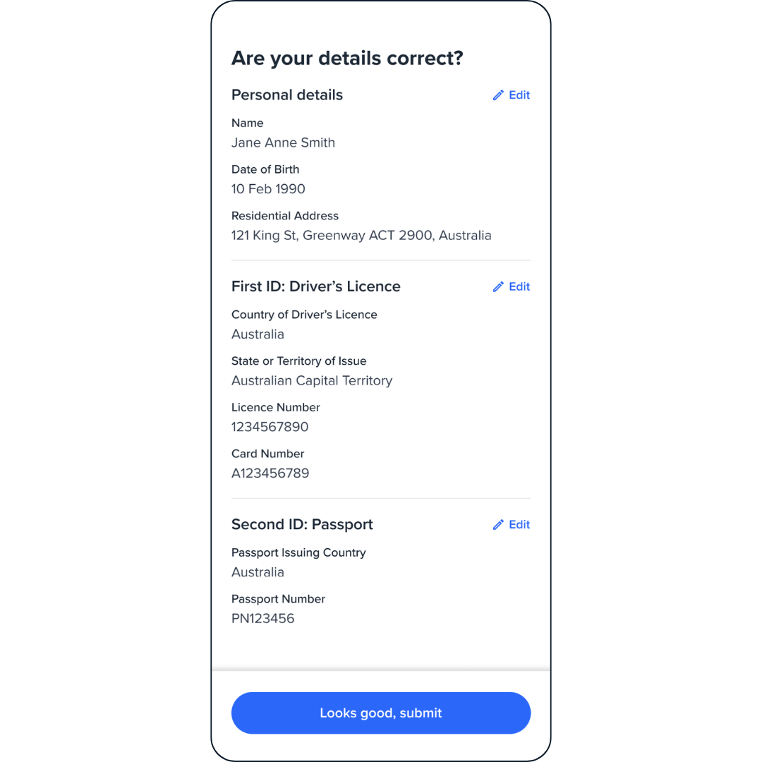
The Manual Flow Review screen presents two main sections:
* **Personal Details**: Name, date of birth, and address
* **Document Details**: Information for each captured ID
Users can edit information by clicking the respective "Edit" buttons to return to the corresponding input screens.
 ### Implementation Guide
```javascript theme={null}
const manualReview = oneSdk.component('form', {
name: "REVIEW",
type: "manual"
});
```
```javascript theme={null}
manualReview.mount("#form");
```
```html theme={null}
```
### Configuration Options
```javascript title="Required Configuration" theme={null}
{
name: "REVIEW", // Screen name
type: "manual" // Flow type
}
```
```javascript title="Optional Configuration" theme={null}
{
title: {
label: "Review your Information"
},
cta: {
label: "Submit your data"
},
verify: true // Enable automatic verification
logo: {
src: './assets/logo.png' // path to your logo
},
style: {
'ff-logo': {
'width': '50px'
}
}
}
```
By default, the Review screen only shows submitted form details. To display specific details before submission, pass `personal` or `documents` configurations. These settings affect both review and edit screens.
The personal and documents configs follow the same structure as their
respective modules. See the Personal Details and
Document Upload module documentation for details.
```javascript title='Passing Personal and Documents Config' theme={null}
{
name: "REVIEW",
type: "manual",
personal: { /* Personal details config — see Personal Details module */ },
documents: { /* Document details config — see Document Upload module */ }
}
```
Details can also be hidden or made read-only
```javascript title='Hide or Make Read Only' theme={null}
{
name: "REVIEW",
type: "manual",
readOnlyForms: ['personal', 'DRIVERS_LICENCE', 'PASSPORT', 'NATIONAL_HEALTH_ID'],
hiddenForms: ['personal', 'DRIVERS_LICENCE', 'PASSPORT', 'NATIONAL_HEALTH_ID']
}
```
### Implementation Guide
```javascript theme={null}
const manualReview = oneSdk.component('form', {
name: "REVIEW",
type: "manual"
});
```
```javascript theme={null}
manualReview.mount("#form");
```
```html theme={null}
```
### Configuration Options
```javascript title="Required Configuration" theme={null}
{
name: "REVIEW", // Screen name
type: "manual" // Flow type
}
```
```javascript title="Optional Configuration" theme={null}
{
title: {
label: "Review your Information"
},
cta: {
label: "Submit your data"
},
verify: true // Enable automatic verification
logo: {
src: './assets/logo.png' // path to your logo
},
style: {
'ff-logo': {
'width': '50px'
}
}
}
```
By default, the Review screen only shows submitted form details. To display specific details before submission, pass `personal` or `documents` configurations. These settings affect both review and edit screens.
The personal and documents configs follow the same structure as their
respective modules. See the Personal Details and
Document Upload module documentation for details.
```javascript title='Passing Personal and Documents Config' theme={null}
{
name: "REVIEW",
type: "manual",
personal: { /* Personal details config — see Personal Details module */ },
documents: { /* Document details config — see Document Upload module */ }
}
```
Details can also be hidden or made read-only
```javascript title='Hide or Make Read Only' theme={null}
{
name: "REVIEW",
type: "manual",
readOnlyForms: ['personal', 'DRIVERS_LICENCE', 'PASSPORT', 'NATIONAL_HEALTH_ID'],
hiddenForms: ['personal', 'DRIVERS_LICENCE', 'PASSPORT', 'NATIONAL_HEALTH_ID']
}
```
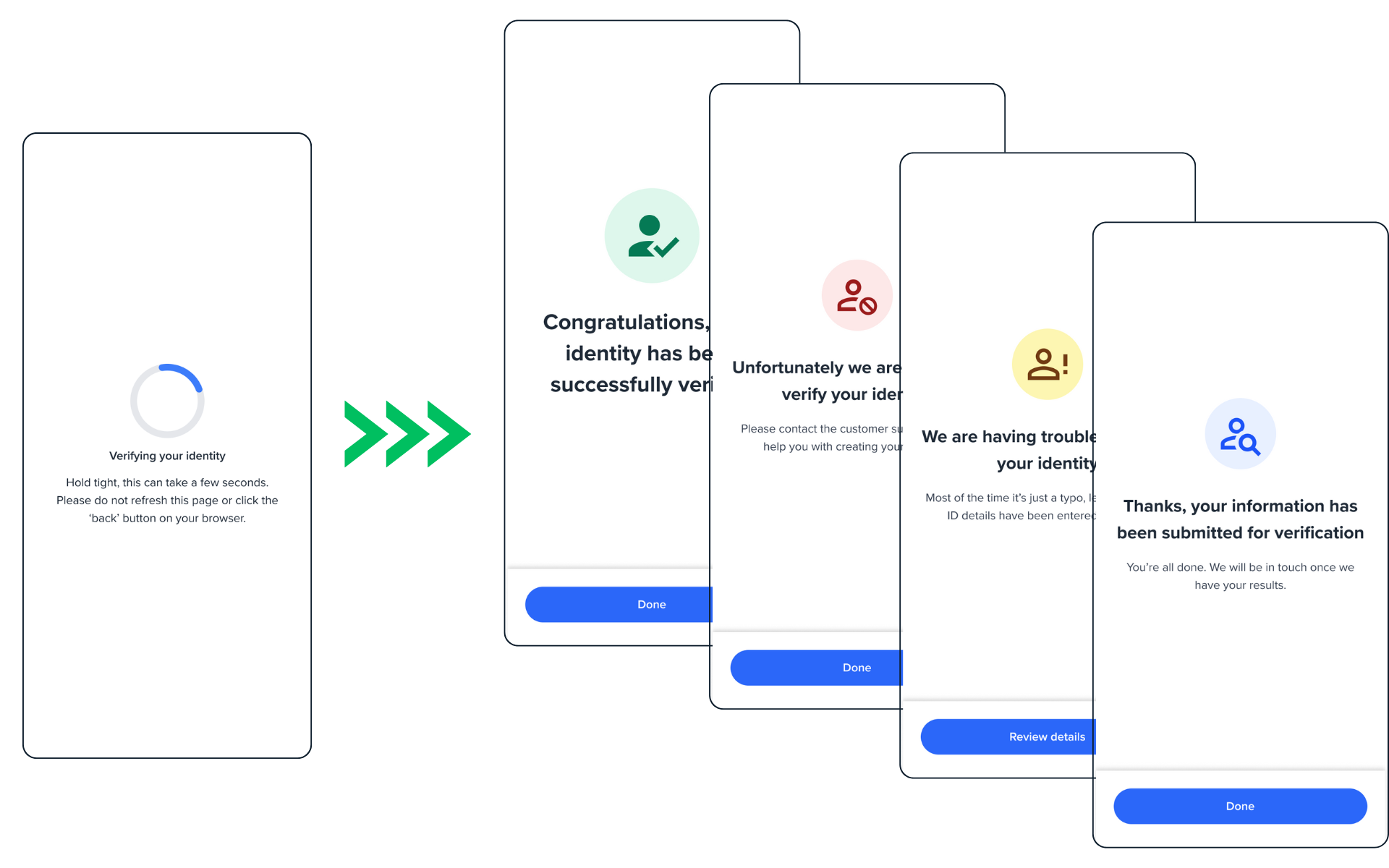 When `verify: true`:
1. User details are saved
2. Verification check runs automatically
3. Loading screen appears during check
4. Result screen displays based on check outcome
To customize the result screen, set `customResult: true` to prevent default screens from mounting. Then handle these events to show your own screens:
* `form:review:success`
* `form:review:failed`
* `form:review:partial`
* `form:review:pending`
```javascript title="Custom Result Handling" theme={null}
// Initialize review component with custom result handling enabled
const review = oneSdk.component("form", {
name: "REVIEW",
type: "manual",
customResult: true // Prevents default result screens from mounting
verify: true // Custom result only applies for verify: true
});
// Create success screen component to show after successful verification
const success = oneSdk.component("form", {
name: "RESULT",
state: "SUCCESS",
title: { label: "Complete" },
descriptions: [{ label: "Process is now complete. You can close the page" }],
creditHeaderIssueTitle: {
label: "Customized Credit Header Issue Title for Success",
style: {
"ff-note-title": {
// Add style for credit header title
},
},
},
creditHeaderIssueDescriptions: [
{
label:
"Customized Credit Header Issue Descriptions Lorem Ipsum Dolor Sit Amet Consectetur Adipiscing Elit. Aliquam Eget Diam Eu Arcu",
},
],
style: {
"ff-note-description": {
// Add style for credit header description
},
},
});
// Create fail screen component to show after failed verification
const failed = oneSdk.component("form", {
name: "RESULT",
state: "FAILED",
title: { label: "Failed" },
descriptions: [{ label: "Process is failed. Please try again." }],
creditHeaderIssueTitle: {
label: "Customized Credit Header Issue Title for Failure",
},
creditHeaderIssueDescriptions: [
{
label:
"Customized Credit Header Issue Descriptions Lorem Ipsum Dolor Sit Amet Consectetur Adipiscing Elit. Aliquam Eget Diam Eu Arcu",
},
{ label: "Another row of text here" },
],
});
// Create partial screen component to show after partially failed verification
const partial = oneSdk.component("form", {
name: "RESULT",
state: "PARTIAL",
title: { label: "Unable to Verify" },
descriptions: [{ label: "Please check the information that you've entered and try again." }],
creditHeaderIssueTitle: {
label: "Customized Credit Header Issue Title for Partial Failure",
},
creditHeaderIssueDescriptions: [
{
label:
"Customized Credit Header Issue Descriptions Lorem Ipsum Dolor Sit Amet Consectetur Adipiscing Elit. Aliquam Eget Diam Eu Arcu",
},
{ label: "Another row of text here" },
],
});
// Listen for successful verification and mount success screen
review.on('form:review:success', () => {
success.mount("#form"); // Mount success component in place of review screen
});
// Listen for failed verification and mount failed screen
review.on('form:review:failed', () => {
failed.mount("#form"); // Mount failed component in place of review screen
});
// Listen for partial verification and mount partial screen
review.on('form:review:partial', () => {
partial.mount("#form"); // Mount partial component in place of review screen
});
```
### Event Handling
Emitted when Review screen initializes
Triggers when some checks succeed but others fail
Fires when submit button is clicked
## OCR Review
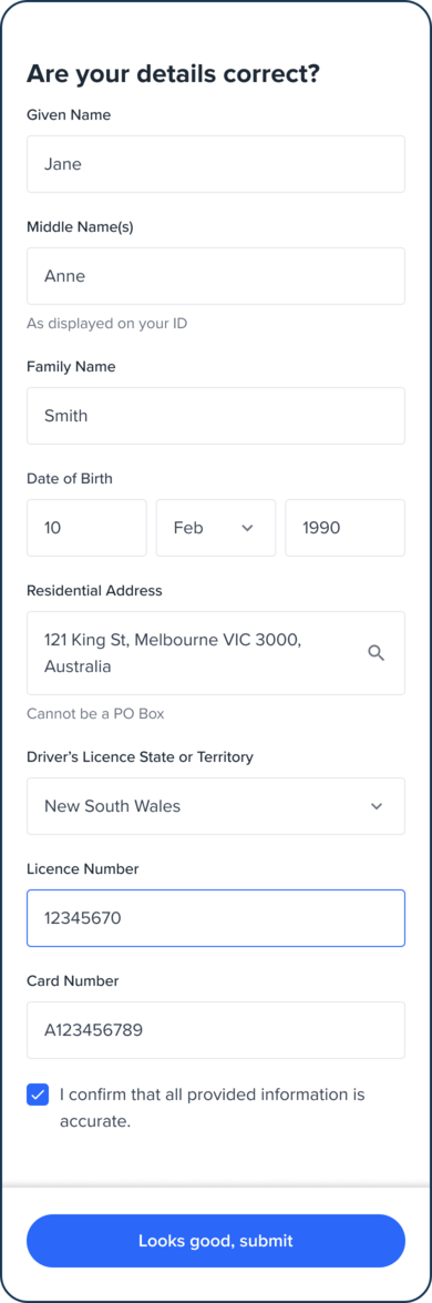
The OCR Review screen allows users to verify and correct information extracted through OCR or IDV modules.
When `verify: true`:
1. User details are saved
2. Verification check runs automatically
3. Loading screen appears during check
4. Result screen displays based on check outcome
To customize the result screen, set `customResult: true` to prevent default screens from mounting. Then handle these events to show your own screens:
* `form:review:success`
* `form:review:failed`
* `form:review:partial`
* `form:review:pending`
```javascript title="Custom Result Handling" theme={null}
// Initialize review component with custom result handling enabled
const review = oneSdk.component("form", {
name: "REVIEW",
type: "manual",
customResult: true // Prevents default result screens from mounting
verify: true // Custom result only applies for verify: true
});
// Create success screen component to show after successful verification
const success = oneSdk.component("form", {
name: "RESULT",
state: "SUCCESS",
title: { label: "Complete" },
descriptions: [{ label: "Process is now complete. You can close the page" }],
creditHeaderIssueTitle: {
label: "Customized Credit Header Issue Title for Success",
style: {
"ff-note-title": {
// Add style for credit header title
},
},
},
creditHeaderIssueDescriptions: [
{
label:
"Customized Credit Header Issue Descriptions Lorem Ipsum Dolor Sit Amet Consectetur Adipiscing Elit. Aliquam Eget Diam Eu Arcu",
},
],
style: {
"ff-note-description": {
// Add style for credit header description
},
},
});
// Create fail screen component to show after failed verification
const failed = oneSdk.component("form", {
name: "RESULT",
state: "FAILED",
title: { label: "Failed" },
descriptions: [{ label: "Process is failed. Please try again." }],
creditHeaderIssueTitle: {
label: "Customized Credit Header Issue Title for Failure",
},
creditHeaderIssueDescriptions: [
{
label:
"Customized Credit Header Issue Descriptions Lorem Ipsum Dolor Sit Amet Consectetur Adipiscing Elit. Aliquam Eget Diam Eu Arcu",
},
{ label: "Another row of text here" },
],
});
// Create partial screen component to show after partially failed verification
const partial = oneSdk.component("form", {
name: "RESULT",
state: "PARTIAL",
title: { label: "Unable to Verify" },
descriptions: [{ label: "Please check the information that you've entered and try again." }],
creditHeaderIssueTitle: {
label: "Customized Credit Header Issue Title for Partial Failure",
},
creditHeaderIssueDescriptions: [
{
label:
"Customized Credit Header Issue Descriptions Lorem Ipsum Dolor Sit Amet Consectetur Adipiscing Elit. Aliquam Eget Diam Eu Arcu",
},
{ label: "Another row of text here" },
],
});
// Listen for successful verification and mount success screen
review.on('form:review:success', () => {
success.mount("#form"); // Mount success component in place of review screen
});
// Listen for failed verification and mount failed screen
review.on('form:review:failed', () => {
failed.mount("#form"); // Mount failed component in place of review screen
});
// Listen for partial verification and mount partial screen
review.on('form:review:partial', () => {
partial.mount("#form"); // Mount partial component in place of review screen
});
```
### Event Handling
Emitted when Review screen initializes
Triggers when some checks succeed but others fail
Fires when submit button is clicked
## OCR Review
The OCR Review screen allows users to verify and correct information extracted through OCR or IDV modules.
 ### Implementation Guide
```javascript theme={null}
const idv = oneSdkInstance.flow('idv');
const review = oneSdkInstance.component("form", {
name: "REVIEW",
type: "ocr"
});
idv.mount("#form");
idv.on('results', () => {
review.mount("#form");
});
review.on('form:review:ready', async () => {
try {
let res = await oneSdkInstance.individual().submit({ verify: true });
} catch(e) {
onsole.error(e);
}
setLoading(false);
result.mount('#form');
});
```
```javascript theme={null}
const ocr = oneSdk.component("ocr");
const review = oneSdkInstance.component("form", {
name: "REVIEW",
type: "ocr"
});
ocr.mount("#form");
ocr.on("results", (document) => {
review.mount("#form");
});
review.on('form:review:ready', async () => {
try {
let res = await oneSdkInstance.individual().submit({ verify: true });
} catch(e) {
onsole.error(e);
}
setLoading(false);
result.mount('#form');
});
```
### Document Field Configuration
##### Configuration Structure
Document fields are configured per document type, with country-specific
configurations available.
```javascript title="Document Configuration Example" theme={null}
documents: [
{
type: 'DRIVERS_LICENCE',
countries: {
default: {
default: {
fields: [
{
fieldType: 'select',
name: 'region',
label: `Driver's Licence State/Territory`,
rules: {
required: {
value: true,
message: 'Please select a state/territory'
}
}
},
// Additional fields...
]
}
}
}
}
]
```
### Field Configuration Reference
* State/Territory: `select`
* License Number: `input`
* Card Number: `input`
* Card Color: `select`
* Card Number: `input`
* Position: `input`
* Expiry: `date`
{" "}
| Property | Description |
| ----------- | -------------------------------------- |
| fieldType | Input type (`select`, `input`, `date`) |
| dataType | Data format (typically `text`) |
| label | Display label |
| name | Field identifier |
| hide | Toggle field visibility |
| helperText | Additional guidance text |
| placeholder | Input placeholder text |
```javascript theme={null}
rules: {
required: {
value: true,
message: "Field is required"
},
minLength: {
value: 1,
message: "Minimum 1 character"
},
maxLength: {
value: 15,
message: "Maximum 15 characters"
},
pattern: {
value: /^[a-zA-Z]+$/,
message: "Letters only"
}
}
```
### Confirmation and button
#### Styling
### Implementation Guide
```javascript theme={null}
const idv = oneSdkInstance.flow('idv');
const review = oneSdkInstance.component("form", {
name: "REVIEW",
type: "ocr"
});
idv.mount("#form");
idv.on('results', () => {
review.mount("#form");
});
review.on('form:review:ready', async () => {
try {
let res = await oneSdkInstance.individual().submit({ verify: true });
} catch(e) {
onsole.error(e);
}
setLoading(false);
result.mount('#form');
});
```
```javascript theme={null}
const ocr = oneSdk.component("ocr");
const review = oneSdkInstance.component("form", {
name: "REVIEW",
type: "ocr"
});
ocr.mount("#form");
ocr.on("results", (document) => {
review.mount("#form");
});
review.on('form:review:ready', async () => {
try {
let res = await oneSdkInstance.individual().submit({ verify: true });
} catch(e) {
onsole.error(e);
}
setLoading(false);
result.mount('#form');
});
```
### Document Field Configuration
##### Configuration Structure
Document fields are configured per document type, with country-specific
configurations available.
```javascript title="Document Configuration Example" theme={null}
documents: [
{
type: 'DRIVERS_LICENCE',
countries: {
default: {
default: {
fields: [
{
fieldType: 'select',
name: 'region',
label: `Driver's Licence State/Territory`,
rules: {
required: {
value: true,
message: 'Please select a state/territory'
}
}
},
// Additional fields...
]
}
}
}
}
]
```
### Field Configuration Reference
* State/Territory: `select`
* License Number: `input`
* Card Number: `input`
* Card Color: `select`
* Card Number: `input`
* Position: `input`
* Expiry: `date`
{" "}
| Property | Description |
| ----------- | -------------------------------------- |
| fieldType | Input type (`select`, `input`, `date`) |
| dataType | Data format (typically `text`) |
| label | Display label |
| name | Field identifier |
| hide | Toggle field visibility |
| helperText | Additional guidance text |
| placeholder | Input placeholder text |
```javascript theme={null}
rules: {
required: {
value: true,
message: "Field is required"
},
minLength: {
value: 1,
message: "Minimum 1 character"
},
maxLength: {
value: 15,
message: "Maximum 15 characters"
},
pattern: {
value: /^[a-zA-Z]+$/,
message: "Letters only"
}
}
```
### Confirmation and button
#### Styling
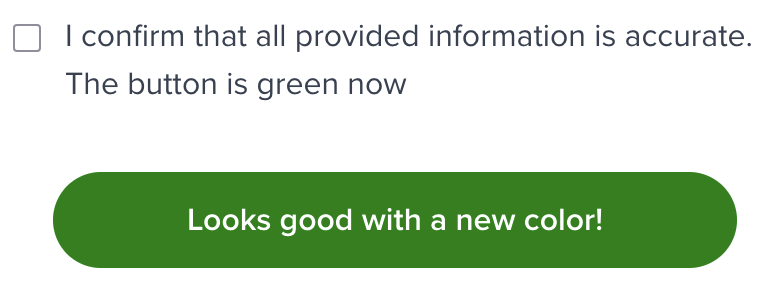
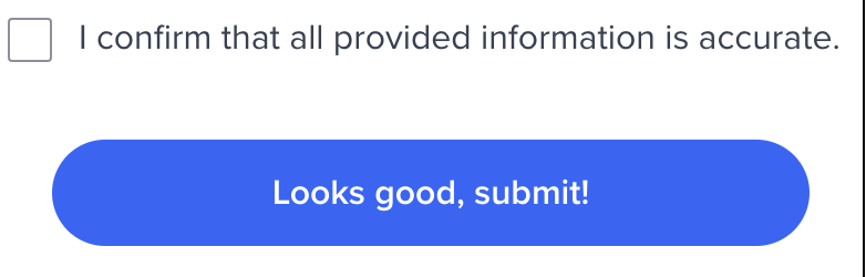 To change checkbox text and button, we can override `instruction` and `cta` properties, for example:
```typescript theme={null}
const reviewOcr = oneSdk.component('form', {
name: 'REVIEW',
type: 'ocr',
verify: true,
instruction: {
content: [
{
label: 'I confirm that all provided information is accurate. The button is green now'
}
]
},
cta: {
label: 'Looks good with a new color!',
style: {
"ff-button": {
"backgroundColor": "green"
}
}
}
});
```
will override the default rules and render
To change checkbox text and button, we can override `instruction` and `cta` properties, for example:
```typescript theme={null}
const reviewOcr = oneSdk.component('form', {
name: 'REVIEW',
type: 'ocr',
verify: true,
instruction: {
content: [
{
label: 'I confirm that all provided information is accurate. The button is green now'
}
]
},
cta: {
label: 'Looks good with a new color!',
style: {
"ff-button": {
"backgroundColor": "green"
}
}
}
});
```
will override the default rules and render
 #### Handling Network Issues during submission
To handle network failures during review screen submission, OneSDK gives the opportunity to retry submissions up to three times, with clear error messages guiding them through network issues, ensuring a smoother and more transparent user experience.
To change properties of retry mechanism, you can override `cta` property by:
```typescript theme={null}
const retryOcr = oneSdk.component('form', {
name: 'REVIEW',
type: 'ocr',
cta: {
retryAmount: RETRY_AMOUNT,
timeoutRetryMiliseconds: RETRY_COUNT_IN_MS,
retryAttemptString: RETRY_ATTEMPT_STRING,
maxRetryAttemptedString: MAX_RETRY_ATTEMPTED_STRING
}
});
```
where:
`retryAmount`: number of retry user can have, default is 3
`timeoutRetryMiliseconds`: number of miliseconds until retry button is clickable again, default is 3000
`retryAttemptString`: a string shown under Submit button to guide your user to retry, default is "Error submitting form. Give it a moment to retry."
`maxRetryAttemptedString`: a string shown under Submit button where user has tried more than `retryAmount`, default is "Something went wrong, please contact customer service or try again in a few moments."
#### Handling Network Issues during submission
To handle network failures during review screen submission, OneSDK gives the opportunity to retry submissions up to three times, with clear error messages guiding them through network issues, ensuring a smoother and more transparent user experience.
To change properties of retry mechanism, you can override `cta` property by:
```typescript theme={null}
const retryOcr = oneSdk.component('form', {
name: 'REVIEW',
type: 'ocr',
cta: {
retryAmount: RETRY_AMOUNT,
timeoutRetryMiliseconds: RETRY_COUNT_IN_MS,
retryAttemptString: RETRY_ATTEMPT_STRING,
maxRetryAttemptedString: MAX_RETRY_ATTEMPTED_STRING
}
});
```
where:
`retryAmount`: number of retry user can have, default is 3
`timeoutRetryMiliseconds`: number of miliseconds until retry button is clickable again, default is 3000
`retryAttemptString`: a string shown under Submit button to guide your user to retry, default is "Error submitting form. Give it a moment to retry."
`maxRetryAttemptedString`: a string shown under Submit button where user has tried more than `retryAmount`, default is "Something went wrong, please contact customer service or try again in a few moments."