> ## Documentation Index
> Fetch the complete documentation index at: https://docs.frankieone.com/llms.txt
> Use this file to discover all available pages before exploring further.
# Vendor Customizations
> IDV Vendor Customizations
## Onfido
### Selecting Onfido SDK Version
By default OneSDK uses Onfido v12 to ensure backward compatibility and seamless integration for existing users. This means no changes are required for customers currently using Onfido v12—your implementation will continue to work as expected.
For those who wish to take advantage of the new features and improvements in Onfido v14, switching is easy. You can configure the desired SDK version programmatically through a simple code setting. This added flexibility allows your application to adapt to evolving needs while maintaining a consistent integration experience. Refer to our documentation for details on how to enable Onfido v14 support in your project.
```typescript theme={null}
const oneSdk = await OneSdk({
// Session object containing authentication details
session: sessionObjectFromBackend,
// Set environment mode
mode: "production",
recipe: {
idv: {
// Configure accepted document types and countries
documents: [
{
type: 'PASSPORT',
countries: ['NZL'], // New Zealand passports only
},
{
type: 'DRIVERS_LICENCE',
countries: ['NZL'], // New Zealand driver's licenses only
},
],
// Specify Onfido as the IDV provider
provider: {
name: "onfido",
sdkVersion: "14",
},
}
ocr: {
provider: {
name: 'onfido',
sdkVersion: '14'
},
},
biometrics: {
provider: {
name: 'onfido',
sdkVersion: '14'
},
},
}
});
```
### Configuring Accepted Documents and Countries
Using Onfido, we can set document and country selection on document capture part of IDV. The customization options available all relate to the country and document type selection screen. By default, the selection screen is shown with the country selection being empty.
Depending on the customization options defined in this step, either the country or document type selection screens might not be shown:
* The country selection screen will not be shown if only 1 country is selected or if only passports are allowed
* The document selection screen will not be shown if only 1 document type is specified
#### Set Document & Country Selection
During the initialisation of OneSdk instance, you can specify accepted documents & countries.
```typescript theme={null}
const oneSdk = await OneSdk({
// Session object containing authentication details
session: sessionObjectFromBackend,
// Set environment mode
mode: "production",
recipe: {
idv: {
// Configure accepted document types and countries
documents: [
{
type: 'PASSPORT',
countries: ['NZL'], // New Zealand passports only
},
{
type: 'DRIVERS_LICENCE',
countries: ['NZL'], // New Zealand driver's licenses only
},
],
// Specify Onfido as the IDV provider
provider: {
name: "onfido"
}
}
}
});
// Initialize the IDV flow
const idv = oneSdk.flow("idv");
// Mount the IDV component to specified HTML element
idv.mount("#html-element");
```
`documents` is an array of object, where:
```typescript theme={null}
// Type definition for OCR configuration options
type OCRRecipeOptions = {
// Optional array of accepted document types and countries
documents?: Array<{
type: DocumentType; // Document type enum value
countries?: Array; // ISO country codes
}>;
// Provider configuration
provider: {
name: 'onfido', // Currently only supports Onfido
}
}
// Supported document type options
enum DocumentType = {
PASSPORT = 'PASSPORT' // Standard passports
NATIONAL_HEALTH_ID = 'NATIONAL_HEALTH_ID' // Health ID cards
NATIONAL_ID = 'NATIONAL_ID' // National ID cards
DRIVERS_LICENCE = 'DRIVERS_LICENCE' // Driver's licenses
}
```
**Due to provider limitations, only one country can be specified in the `countries` array.**
For example, if you attempt to set different countries for different document types like this:
```typescript theme={null}
documents: [
{
type: 'PASSPORT',
countries: ['NZL'], // New Zealand passports
},
{
type: 'DRIVERS_LICENCE',
countries: ['SGP'], // Singapore driver's licenses - this will cause fallback
},
],
```
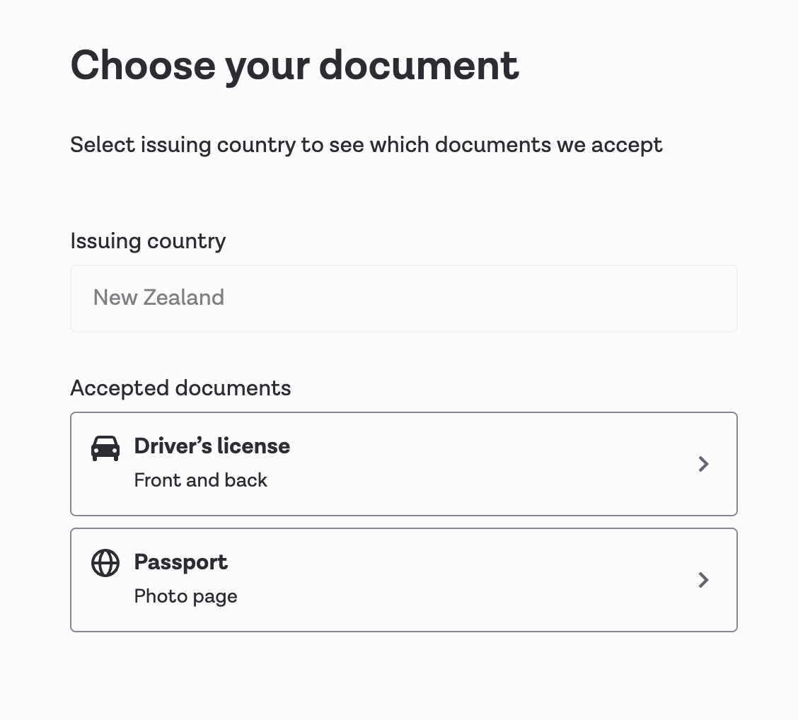
Onfido will fallback to displaying the selection screen for the complete list of documents supported within the selection screens.
Instead of showing country selection, the selection screen will directly show the document types allowed.
 ### Style Customization
Onfido provides styling capabilities to customize the UI to be more suitable for
your application. To apply custom styling, you can put the following style
config to `customUI` in the `provider` object.:
```typescript theme={null}
type OnfidoCustomUIProps = {
borderRadiusButton?: string;
borderStyleSurfaceModal?: string;
fontWeightBody?: number;
fontSizeBody?: string;
fontSizeSubtitle?: string;
fontSizeTitle?: string;
colorBackgroundSurfaceModal?: string;
colorBackgroundIcon?: string;
colorBorderLinkUnderline?: string;
colorBackgroundLinkActive?: string;
colorBackgroundLinkHover?: string;
colorBackgroundDocTypeButton?: string;
colorContentBody?: string;
colorContentTitle?: string;
colorContentSubtitle?: string;
colorContentButtonPrimaryText?: string;
colorBackgroundButtonPrimary?: string;
colorBackgroundButtonPrimaryHover?: string;
colorBackgroundButtonPrimaryActive?: string;
colorContentButtonSecondaryText?: string;
colorBackgroundButtonSecondary?: string;
colorBackgroundButtonSecondaryHover?: string;
colorBackgroundButtonSecondaryActive?: string;
colorContentLinkTextHover?: string;
colorBorderDocTypeButton?: string;
colorBackgroundDocTypeButtonHover?: string;
colorBackgroundDocTypeButtonActive?: string;
colorContentDocTypeButton?: string;
colorIcon?: string;
colorContentInfoPill?: string;
colorBackgroundInfoPill?: string;
colorBackgroundSelector?: string;
colorInputOutline?: string;
colorContentButtonTertiaryText?: string;
colorContentInput?: string;
colorBackgroundInput?: string;
colorBorderInput?: string;
}
```
Please refer to [Onfido's customUI styling options ](https://documentation.onfido.com/sdk/web/#styling-customization) for supported styling keys.
For Onfido 14, there is a new theme options to be set in the `provider`
object. The options are `light` and `dark`. The default value is `light`.
Here is an example of how to apply custom styling:
```typescript theme={null}
const oneSdk = await OneSdk({
// Session object containing authentication details
session: sessionObjectFromBackend,
// Set environment mode
mode: "production",
recipe: {
idv: {
// Configure accepted document types and countries
documents: [
{
type: 'PASSPORT',
countries: ['NZL'], // New Zealand passports only
},
{
type: 'DRIVERS_LICENCE',
countries: ['NZL'], // New Zealand driver's licenses only
},
],
// Specify Onfido as the IDV provider
provider: {
name: "onfido",
sdkVersion: "14",
}
},
ocr: {
provider: {
name: 'onfido',
sdkVersion: '12',
customUI: {
colorBorderInput: "#FF0000", // you can use hex or rgb
// any other style config here
},
},
},
biometrics: {
provider: {
name: 'onfido',
sdkVersion: '14',
theme: 'dark', // or 'light' (default is 'light')
customUI: {
colorBorderInput: "rgb(255, 0, 0)", // you can use hex or rgb
// any other style config here
},
},
},
}
});
```
## Incode
### Style Customization
OneSDK use Incode low code approach. to customize the appearance of the Incode
you have to define a custom CSS and our support team can help you to apply the
CSS in Incode portal.
Please refer to [Incode's theming documentation ](https://developer.incode.com/docs/styling) for more details on customizing the appearance.
## Daon
### Style Customization
To customize the appearance of the Daon, you have to contact our support team.
here are customizable options that Daon provides:
#### Custom Colors
* **General** - Is the overarching theme.
* **Buttons** - Reflect the buttons that appear.
* **Text** - The text on the page.
* **Input** - Will affect elements such as the search boxes where an end-user can enter values.
* **Country Selection** - Enables users to configure the color scheme for the country selection screen.
* **Document Selection** - Enables users to configure the color scheme for the document selection screen.
* **Document Capture** - Enables users to configure the color scheme for the document capture screen.
* **Face Capture** - Enables users to configure the color scheme for the face capture screen.
* **Header** - Sets the color scheme for pager headers.
* **Stepper** - Sets the color scheme of the left-side list of steps that appears when completing the process via desktop.
* **Progress Bar** - Represents the color of the progress bar.
* **Other** - Sets the color of the icons that appear on the intro screen and preview borders.
#### Icons
* **Logo** - The main logo that will be displayed at the top of the app page.
* **Mobile Switch Icon** - The icon that will appear on the 'Switch to your phone' step.
* **Consent Icon** - The icon that will appear on the 'Consent' step.
* **Face Capture Icon** - The icon that will appear on the 'Selfie' step.
* **Document Capture Icon** - The icon that will appear on the document capture screen.
* **Additional Documents Icon** - The icon that will appear on the additional document capture screen.
* **Custom Form Icon** - The icon that will appear on the custom form screen.
#### Fonts
* **Regular Font** - The font style used for general text that is displayed to the end user.
* **Medium Font** - The font style used for medium font such as sub-titles.
* **Bold Font** - The font style used for bold font such as headings.
#### Media
Themes enable users to upload custom images that will appear on the various capture instructions screens.
Supported file types include: .jpg, .png, .jpeg, .svg, .gif, .mp4, and .webm. All files have a maximum size of 5MB.
* **Document Capture Instructions Front** - Sets the image that will appear on the front document capture instructions screen.
* **Document Capture Instructions Back** - Sets the image that will appear on the back document capture instructions screen.
* **Face Capture Instructions** - Sets the image that will appear on the face capture instructions screen screen.
* **Manual Capture Instructions Front** - Sets the image that will appear on the front manual capture instructions screen.
* **Manual Capture Instructions Back** - Sets the image that will appear on the back manual capture instructions screen.
* **Switch To Mobile Waiting** - Configure the image that appears on the desktop application while the end-user is directed to complete the flow on mobile.
* **Processing Screen Image Front** - Sets the image that will appear during the front facing processing capture screen.
* **Processing Screen Image Back** - Sets the image that will appear during the back facing processing capture screen.
### Style Customization
Onfido provides styling capabilities to customize the UI to be more suitable for
your application. To apply custom styling, you can put the following style
config to `customUI` in the `provider` object.:
```typescript theme={null}
type OnfidoCustomUIProps = {
borderRadiusButton?: string;
borderStyleSurfaceModal?: string;
fontWeightBody?: number;
fontSizeBody?: string;
fontSizeSubtitle?: string;
fontSizeTitle?: string;
colorBackgroundSurfaceModal?: string;
colorBackgroundIcon?: string;
colorBorderLinkUnderline?: string;
colorBackgroundLinkActive?: string;
colorBackgroundLinkHover?: string;
colorBackgroundDocTypeButton?: string;
colorContentBody?: string;
colorContentTitle?: string;
colorContentSubtitle?: string;
colorContentButtonPrimaryText?: string;
colorBackgroundButtonPrimary?: string;
colorBackgroundButtonPrimaryHover?: string;
colorBackgroundButtonPrimaryActive?: string;
colorContentButtonSecondaryText?: string;
colorBackgroundButtonSecondary?: string;
colorBackgroundButtonSecondaryHover?: string;
colorBackgroundButtonSecondaryActive?: string;
colorContentLinkTextHover?: string;
colorBorderDocTypeButton?: string;
colorBackgroundDocTypeButtonHover?: string;
colorBackgroundDocTypeButtonActive?: string;
colorContentDocTypeButton?: string;
colorIcon?: string;
colorContentInfoPill?: string;
colorBackgroundInfoPill?: string;
colorBackgroundSelector?: string;
colorInputOutline?: string;
colorContentButtonTertiaryText?: string;
colorContentInput?: string;
colorBackgroundInput?: string;
colorBorderInput?: string;
}
```
Please refer to [Onfido's customUI styling options ](https://documentation.onfido.com/sdk/web/#styling-customization) for supported styling keys.
For Onfido 14, there is a new theme options to be set in the `provider`
object. The options are `light` and `dark`. The default value is `light`.
Here is an example of how to apply custom styling:
```typescript theme={null}
const oneSdk = await OneSdk({
// Session object containing authentication details
session: sessionObjectFromBackend,
// Set environment mode
mode: "production",
recipe: {
idv: {
// Configure accepted document types and countries
documents: [
{
type: 'PASSPORT',
countries: ['NZL'], // New Zealand passports only
},
{
type: 'DRIVERS_LICENCE',
countries: ['NZL'], // New Zealand driver's licenses only
},
],
// Specify Onfido as the IDV provider
provider: {
name: "onfido",
sdkVersion: "14",
}
},
ocr: {
provider: {
name: 'onfido',
sdkVersion: '12',
customUI: {
colorBorderInput: "#FF0000", // you can use hex or rgb
// any other style config here
},
},
},
biometrics: {
provider: {
name: 'onfido',
sdkVersion: '14',
theme: 'dark', // or 'light' (default is 'light')
customUI: {
colorBorderInput: "rgb(255, 0, 0)", // you can use hex or rgb
// any other style config here
},
},
},
}
});
```
## Incode
### Style Customization
OneSDK use Incode low code approach. to customize the appearance of the Incode
you have to define a custom CSS and our support team can help you to apply the
CSS in Incode portal.
Please refer to [Incode's theming documentation ](https://developer.incode.com/docs/styling) for more details on customizing the appearance.
## Daon
### Style Customization
To customize the appearance of the Daon, you have to contact our support team.
here are customizable options that Daon provides:
#### Custom Colors
* **General** - Is the overarching theme.
* **Buttons** - Reflect the buttons that appear.
* **Text** - The text on the page.
* **Input** - Will affect elements such as the search boxes where an end-user can enter values.
* **Country Selection** - Enables users to configure the color scheme for the country selection screen.
* **Document Selection** - Enables users to configure the color scheme for the document selection screen.
* **Document Capture** - Enables users to configure the color scheme for the document capture screen.
* **Face Capture** - Enables users to configure the color scheme for the face capture screen.
* **Header** - Sets the color scheme for pager headers.
* **Stepper** - Sets the color scheme of the left-side list of steps that appears when completing the process via desktop.
* **Progress Bar** - Represents the color of the progress bar.
* **Other** - Sets the color of the icons that appear on the intro screen and preview borders.
#### Icons
* **Logo** - The main logo that will be displayed at the top of the app page.
* **Mobile Switch Icon** - The icon that will appear on the 'Switch to your phone' step.
* **Consent Icon** - The icon that will appear on the 'Consent' step.
* **Face Capture Icon** - The icon that will appear on the 'Selfie' step.
* **Document Capture Icon** - The icon that will appear on the document capture screen.
* **Additional Documents Icon** - The icon that will appear on the additional document capture screen.
* **Custom Form Icon** - The icon that will appear on the custom form screen.
#### Fonts
* **Regular Font** - The font style used for general text that is displayed to the end user.
* **Medium Font** - The font style used for medium font such as sub-titles.
* **Bold Font** - The font style used for bold font such as headings.
#### Media
Themes enable users to upload custom images that will appear on the various capture instructions screens.
Supported file types include: .jpg, .png, .jpeg, .svg, .gif, .mp4, and .webm. All files have a maximum size of 5MB.
* **Document Capture Instructions Front** - Sets the image that will appear on the front document capture instructions screen.
* **Document Capture Instructions Back** - Sets the image that will appear on the back document capture instructions screen.
* **Face Capture Instructions** - Sets the image that will appear on the face capture instructions screen screen.
* **Manual Capture Instructions Front** - Sets the image that will appear on the front manual capture instructions screen.
* **Manual Capture Instructions Back** - Sets the image that will appear on the back manual capture instructions screen.
* **Switch To Mobile Waiting** - Configure the image that appears on the desktop application while the end-user is directed to complete the flow on mobile.
* **Processing Screen Image Front** - Sets the image that will appear during the front facing processing capture screen.
* **Processing Screen Image Back** - Sets the image that will appear during the back facing processing capture screen.