IdScanVerification is defined, we use the Onfido Web SDK to execute the document scan and selfie captures, and use it when assessing the user’s check status.
We wrap the Onfido SDK to simplify the integration and only update versions when it makes sense. To define which version of our wrapper you’d like to use, include releaseVersion in the object passed to idScanVerification.
typescript
Wrapper version log
Default fallback option
For v1.2, Onfido Motion will be set as the default liveness check. If the user’s device doesn’t support Onfido Motion, the user will get an error in the browser.In v1.1, where the default liveness check is Onfido Video, if the user’s device isn’t supported, it defaults to the selfie photo liveness check automatically.New modal layout (v1.1+)
title=“Removed option injectedCss”>
The biggest changes with this new layout are:- Onfido styles are no longer scoped to the Smart UI
- The HTML elements will most likely use different selectors, so simply applying the old styles in
injectedCssglobally might not work. Please review the impact of this change within your application before using it in production.
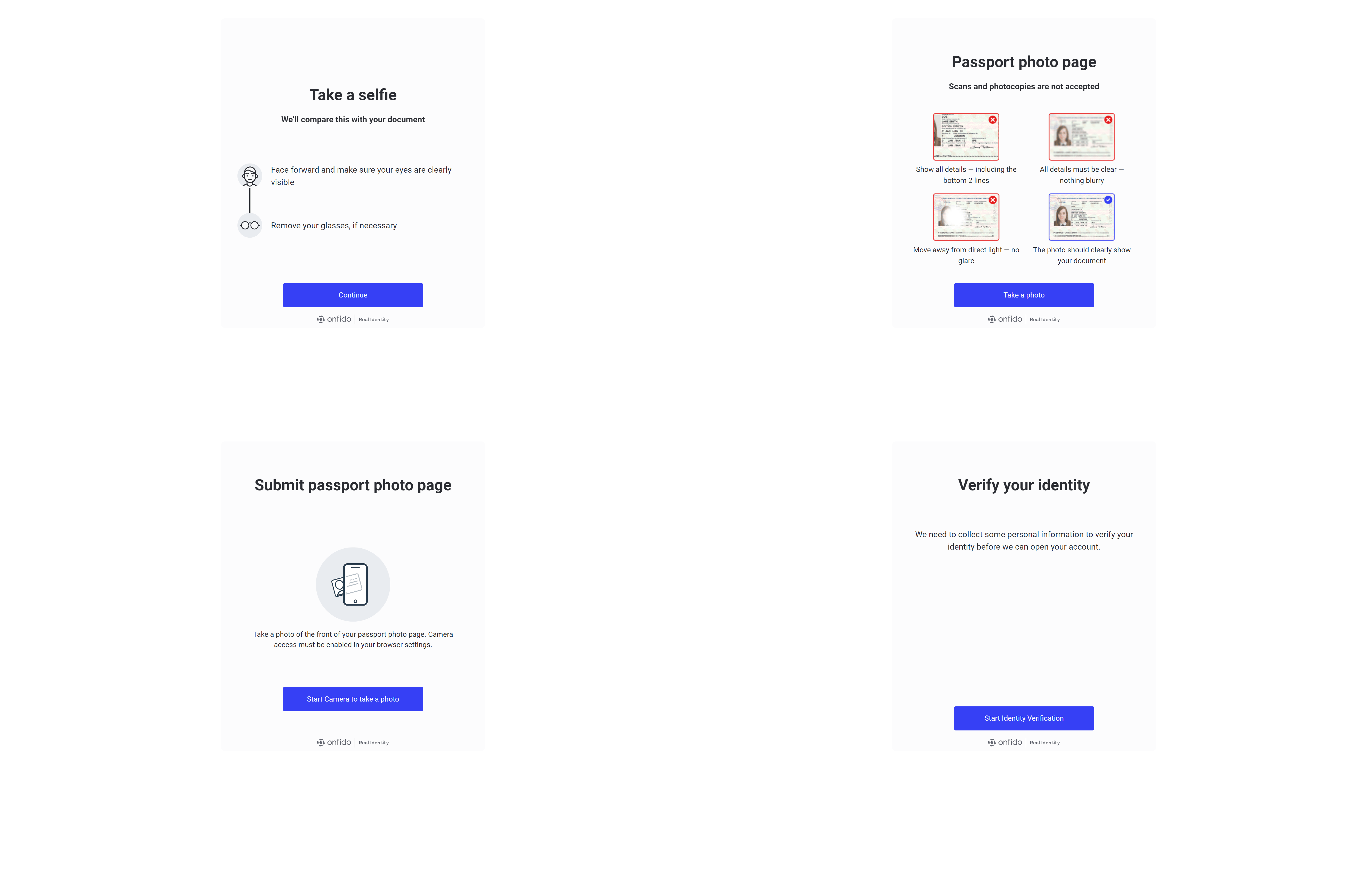
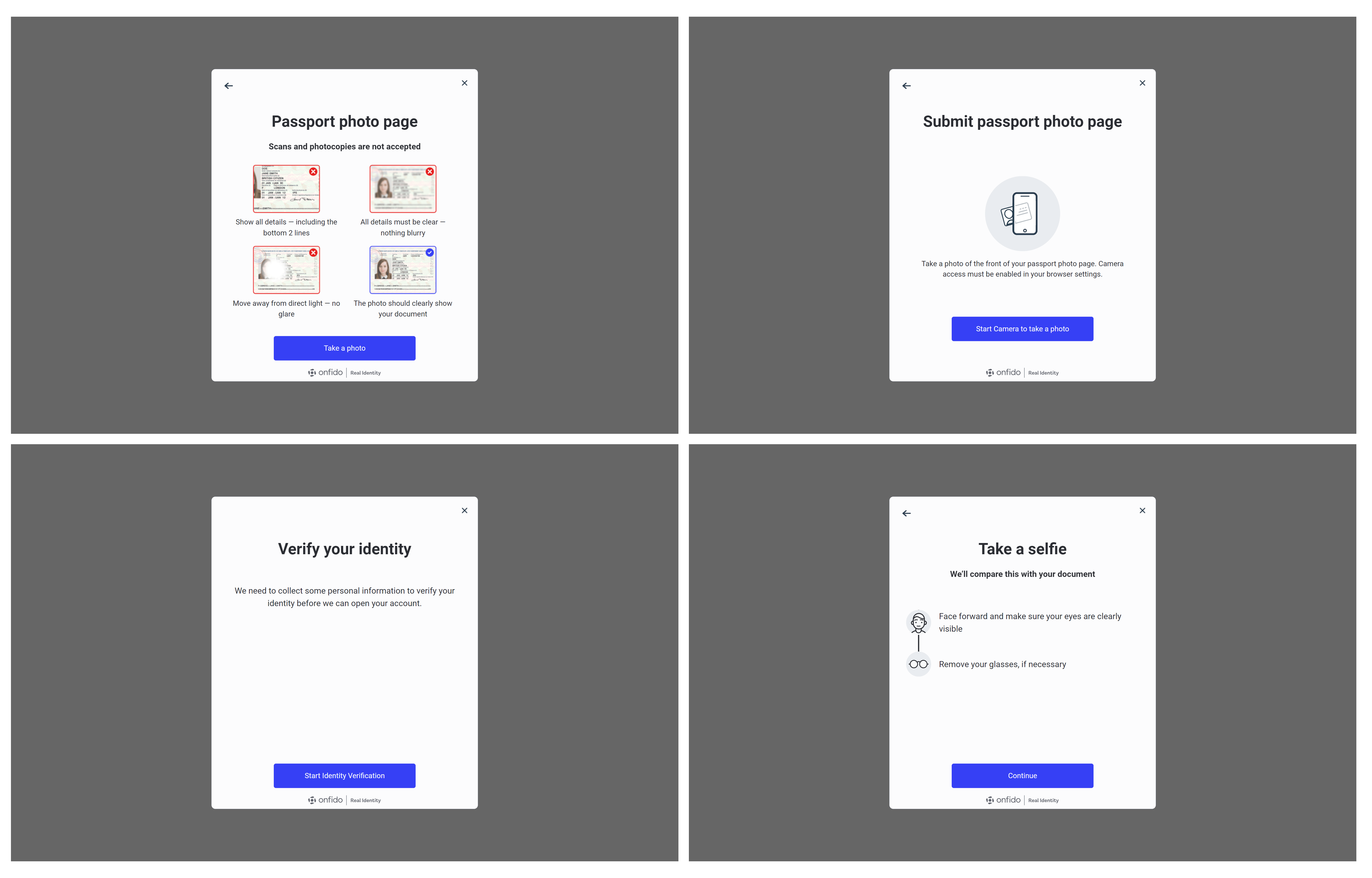
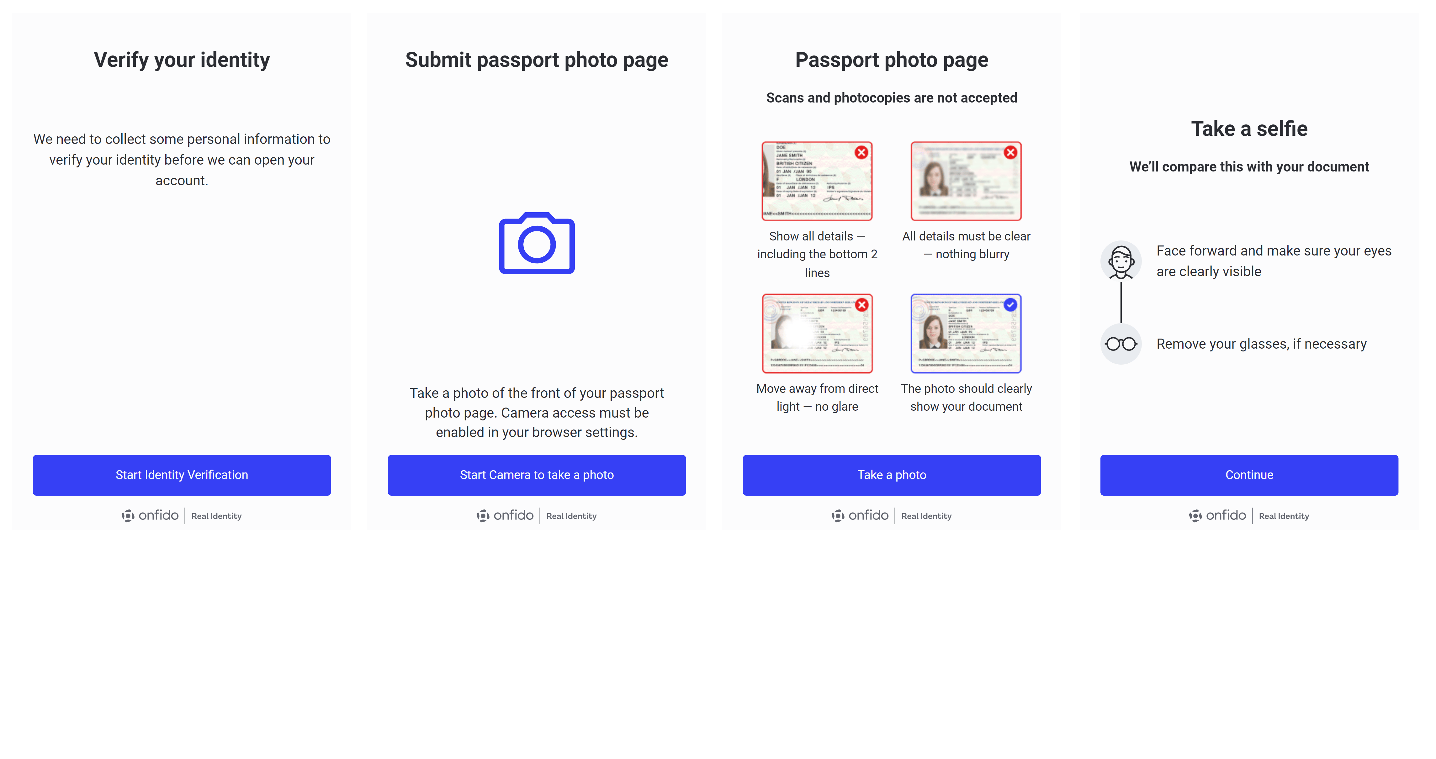
Mobile view
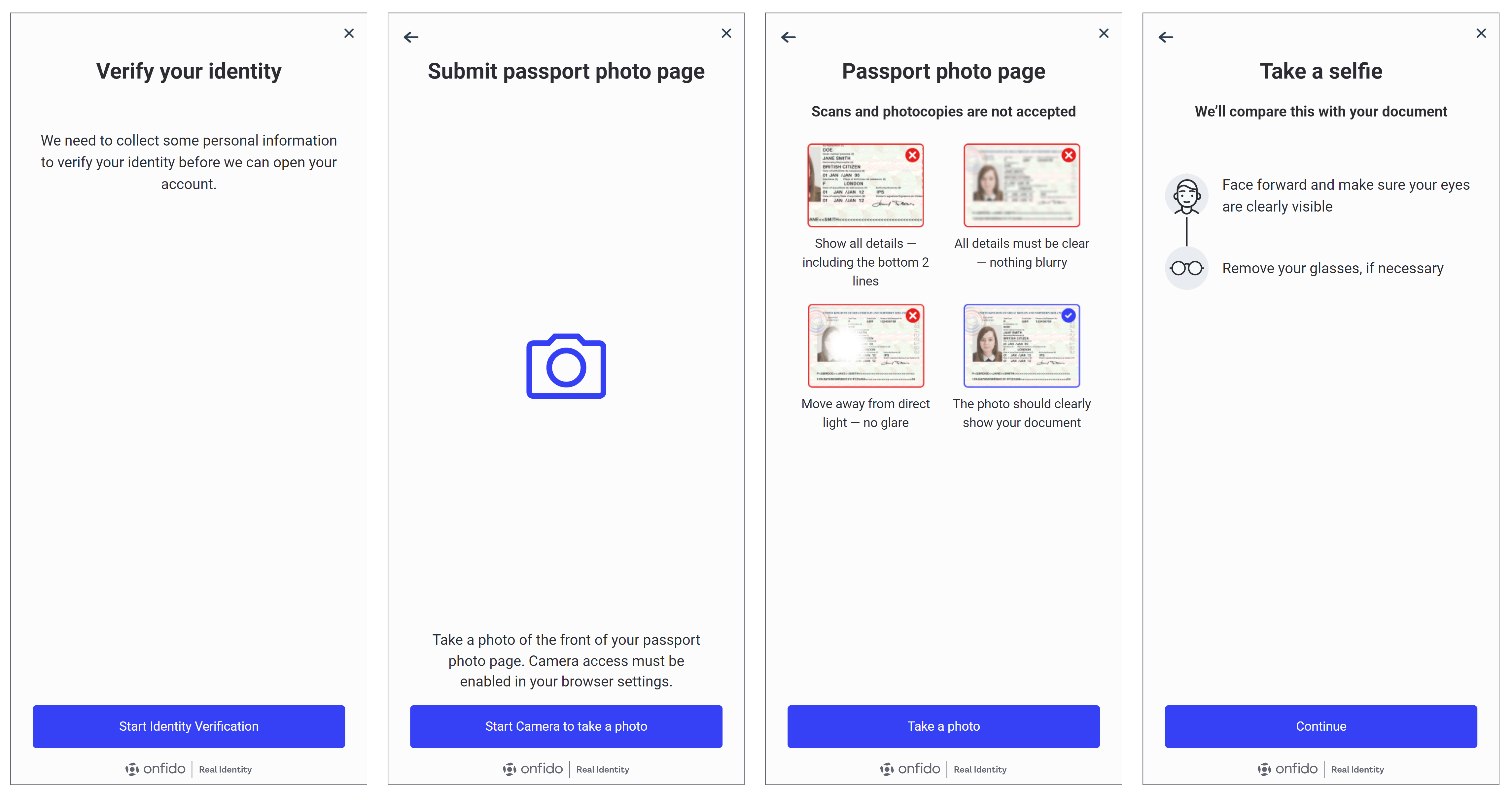
Desktop view
Old design without modal (v1.0)
In the mobile view, the content is designed with a fixed height and is non-responsive, which leaves a white space at the bottom of the screen. This design choice may affect the user experience on mobile devices. On the desktop view, a light grey container is placed at the centre of the screen, set against a white background, creating a minimalist aesthetic. Generally, there is no back button available in both views, which might require users to rely on other navigation methods. This design is consistent across both mobile and desktop platforms.Mobile view
Desktop view