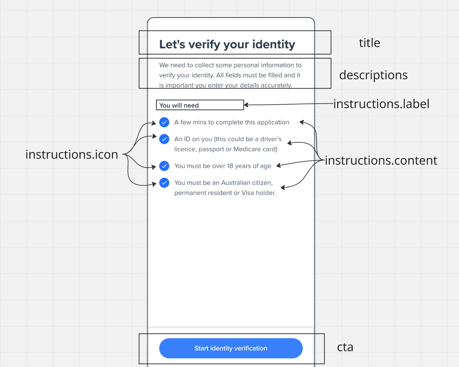
The Welcome screen serves as the entry point of your onboarding flow, providing users with essential information and instructions before they begin the verification process.
const welcome = oneSdk.component('form', {
  name: "WELCOME", // Set the screen name identifier
  type: "manual",  // Set form type to manual input
  title: { // Configure the title section
    label: "Let's Get Started!",
    style: { 'ff-title': { color: '#2563eb' } } // Style title color
  },
  cta: { // Configure the call-to-action button
    label: "Continue",
    style: { 'ff-button': { backgroundColor: '#2563eb' } } // button bg color
  }
});
Copy
Ask AI
// Initialize welcome screen component with form typeconst welcome = oneSdk.component('form', {// Set screen name and typename: "WELCOME",type: "manual",title: { // Configure title section label: "Let's verify your identity", style: { 'ff-title': { 'font-family': 'Helvetica', 'font-size': '24px' }}},descriptions: [ // Add descriptive text below title { label: 'Please have your documents ready', style: { 'ff-description': { color: '#4b5563' } } }],instructions: { // Configure document requirements list content: [ { label: "A valid passport OR", icon: './assets/bullet-point.svg' // Bullet point icon for list items }, { label: "An Australian driver's license", icon: './assets/bullet-point.svg' } ], // Style instructions container style: { 'ff-instructions': { 'font-family': 'Helvetica', 'margin-top': '20px' } }},// Configure the call-to-action buttoncta: { label: 'Begin Verification', style: { 'ff-button': { backgroundColor: '#2563eb', padding: '12px 24px' } }}});
Use consistent colors and fonts across your implementation
Ensure sufficient contrast for accessibility
Maintain padding and spacing for readability
Test your customizations across different screen sizes
All styling should be applied through the appropriate style objects (ff-title, ff-description, ff-instructions, ff-button). Direct CSS manipulation isn’t recommended.