| Tab | What it shows |
|---|---|
| Individual | Pass rates and primary fail reasons for individual KYC checks |
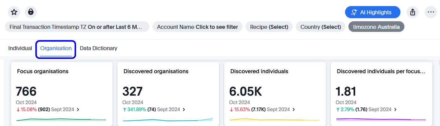
| Organisation | Focus organizations, discovered organizations, and discovered individuals |
| OneSDK | Customer drop-out rates, time to complete, and primary fail reasons for OneSDK flows |
| AML | AML screening outcomes, match dispositions, and changes over time |
| Activity | Alert volumes, resolution times, and monitoring effectiveness metrics for Transaction and Activity Monitoring |
| Risk | Entity risk levels, contributing factors, and assessment history |
| Data Dictionary | Definitions of the metrics and terms used across all analytics tabs |
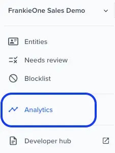
Log into your portal and navigate to the analytics tab
Set the view options
At the top of the Analytics page, you can set the following view options:| Option | Description |
|---|---|
| Final Transaction Timestamp TZ | Sets the period or date range to display. |
| Recipe | Lists all recipe types for the selected period. Select the ones you want to display. |
| Account | Lists the accounts and sub-accounts you have access to. Select the ones to view. |
| Timezone | Lists the available time zones to display data in. |

Individual tab
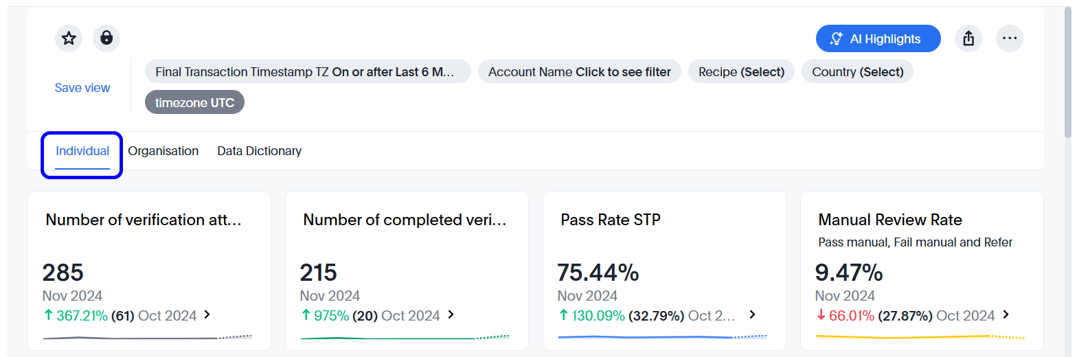
All data set timestamps are in UTC. The Portal’s Entities tab displays time in your local browser time zone.
Organisation tab
If you are a KYB primary customer you can request a KYB Standard Dashboard via the jira support system or send an email through help@frankieone.com
OneSDK tab
If you use our OneSDK, review this tab for information on customer drop-out rates, time to complete, and primary fail reasons.AML tab
The AML tab shows the results of AML screening for your customers — including PEP, sanctions, adverse media, and watchlist checks. Use this tab to monitor screening performance, manage your open hit queue, and track how your high-risk population changes over time. The tab includes four KPI tiles showing your current AML pass rate, entities needing attention, weekly hit rate, and screening volume — alongside charts covering STP pass rate over time, disposition summary, high-risk population trend, weekly hit counts by type, and false and true positive rates.Activity tab
The Activity tab provides operational metrics for Transaction and Activity Monitoring (TM). Use this tab to monitor alert volumes, review resolution performance, and assess the effectiveness of your monitoring rules over time. For a full description of the available metrics and filters, see Analytics dashboard — Transaction and Activity Monitoring.Risk tab
The Risk tab provides a view of the current risk state of your customer population. It includes four charts:- Risk level distribution — a breakdown of your entities by current risk level (Low, Medium, High, and Unacceptable), with KPI tiles showing counts and week-on-week comparisons.
- Top contributing risk factors — the factors driving the most risk across your entities, ranked by total effective factor score and segmented by risk level.
- Assessment history timeline — average risk scores per month across your entity population, segmented by risk level, showing how your overall risk profile has changed over time.
- Risk level changes over time — a monthly view of how many entities moved between risk levels between assessments, broken down by transition direction.
Data dictionary tab
The Data Dictionary tab defines the metrics and terms used across all analytics tabs. Refer to this tab to understand how values are calculated and what each field represents.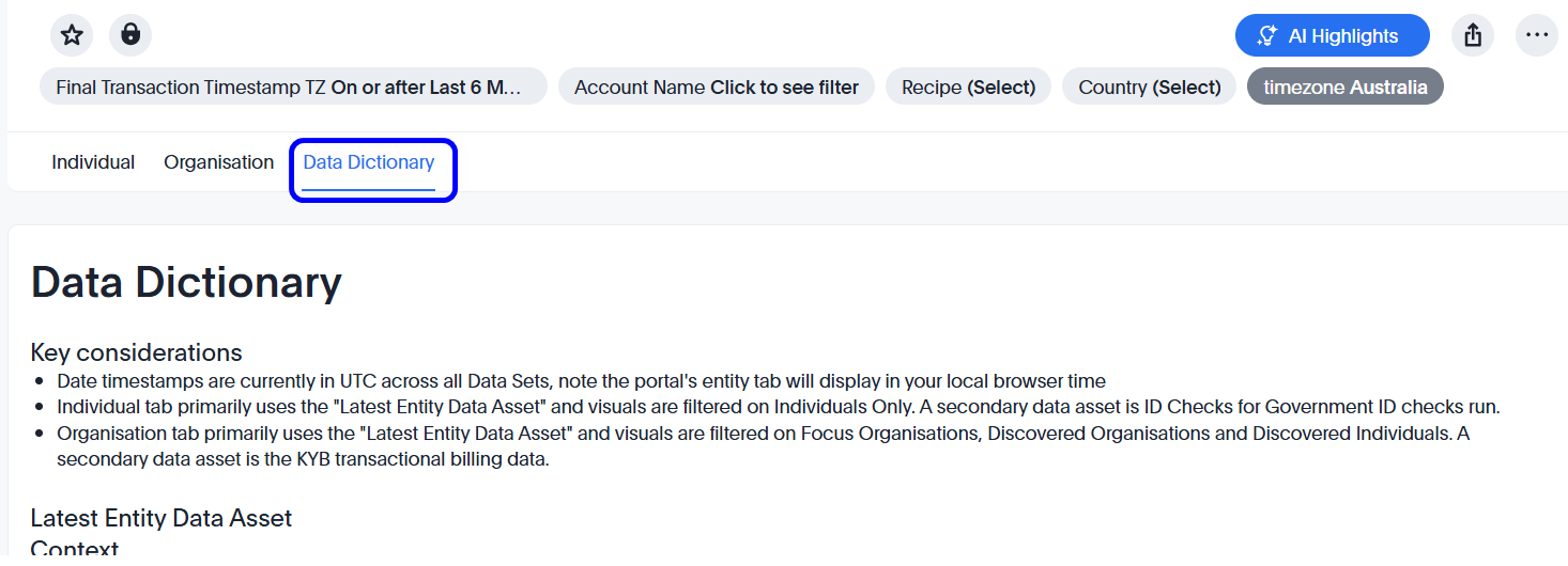
Common dashboard actions
Filter data according to your selection
To filter the data presented and only display a specific type of information, select that information type on the graph, open its context menu, and select Filter.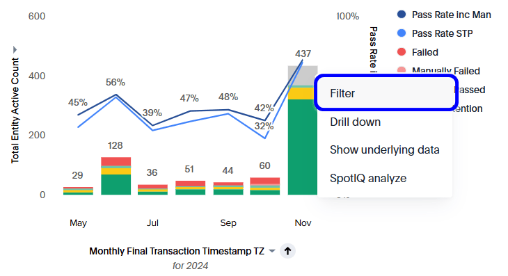
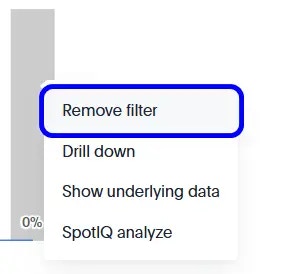
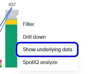
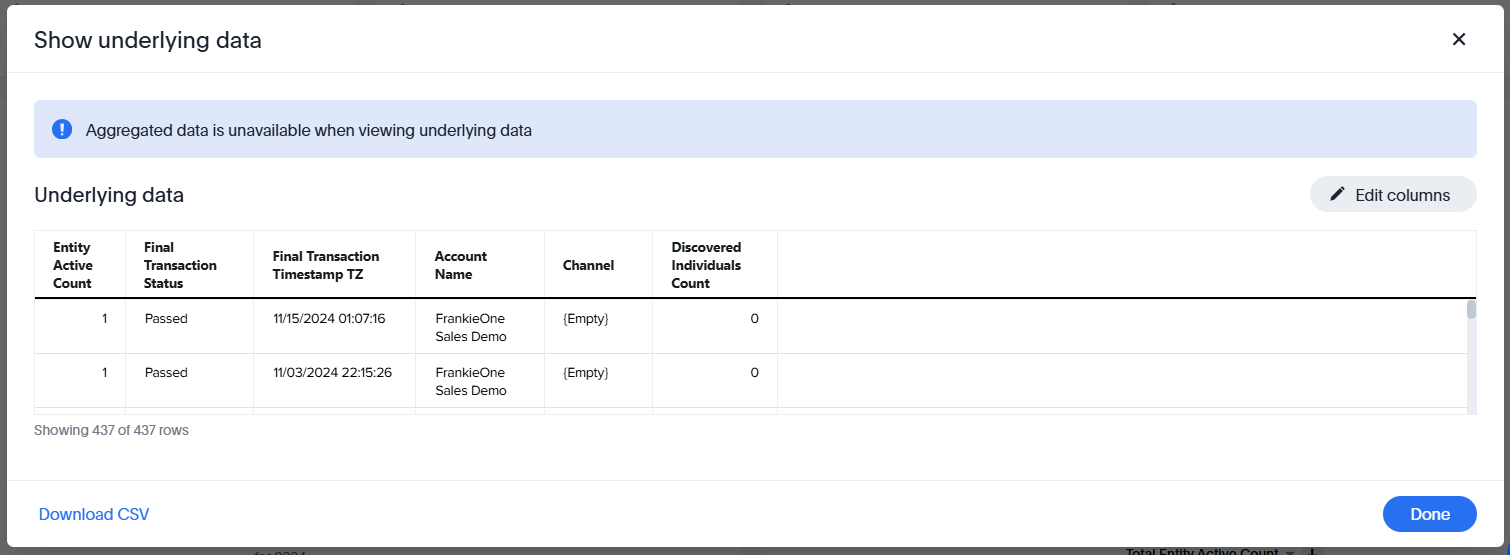
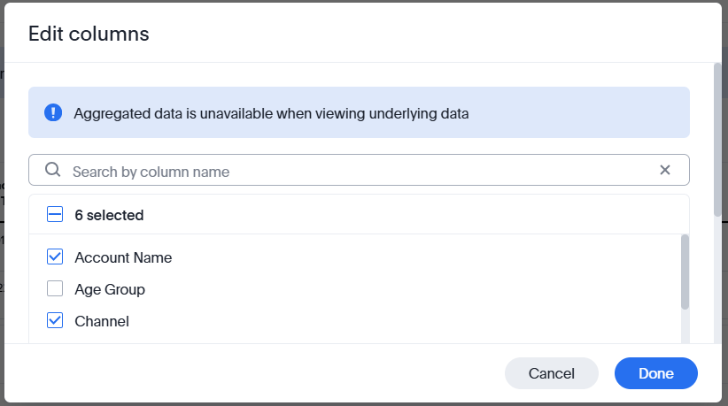
Drill down and show underlying data
Embedded analytics allows you to drill down and view underlying data. You can use filters to filter across the visuals, providing you with a more customized view of your data.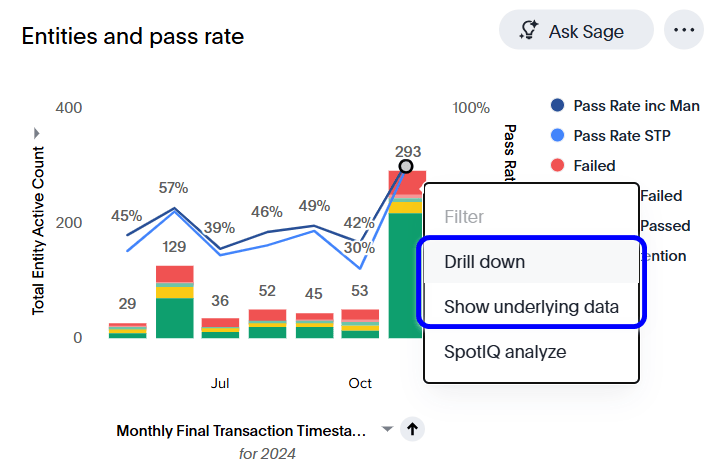


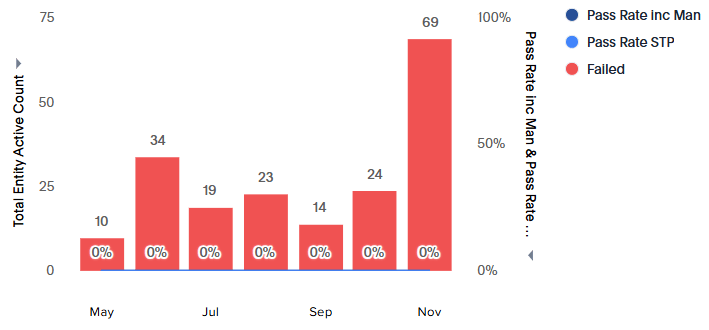
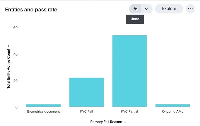
Drill down on data for further information
You can further investigate the data for a particular status by opening the context menu for the data you want to investigate and selecting Drill down. For example, drill down on the Failed data and select Primary Fail Reason.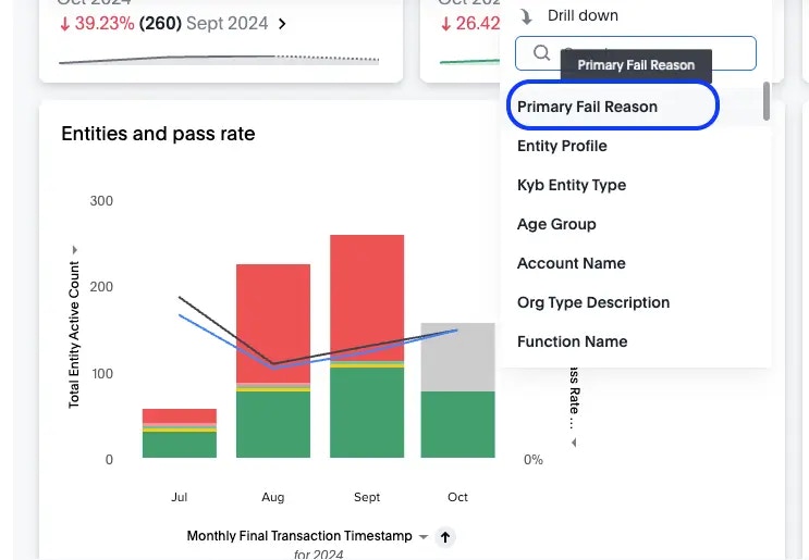
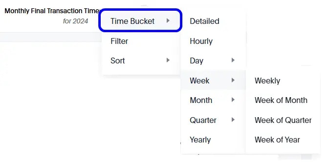
Change the time series
To change the time series on a visual, select the time series selection menu at the bottom of the graph and select Time Bucket.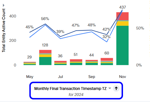
Filter data by date
To display data for specific dates, select the time series selection menu and select Filter.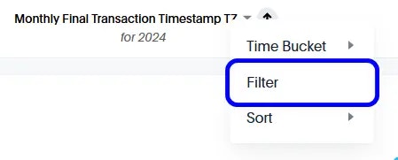
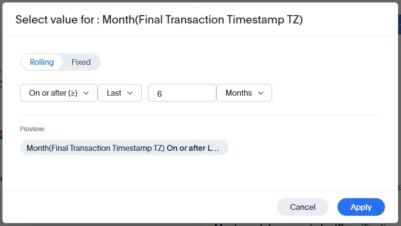
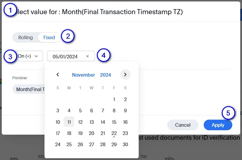
Specific date sample
You want to display the data for a specific date, such as 11-Nov-2024. To do so:- Open the Select value modal.
- Select Fixed.
- On the dropdown selection menus, select On (=).
- Select the date from the date selection menu.
- Select Apply.
Additional features
In addition to the actions mentioned above, you can use additional features to fully exploit the capabilities of the Analytics page.
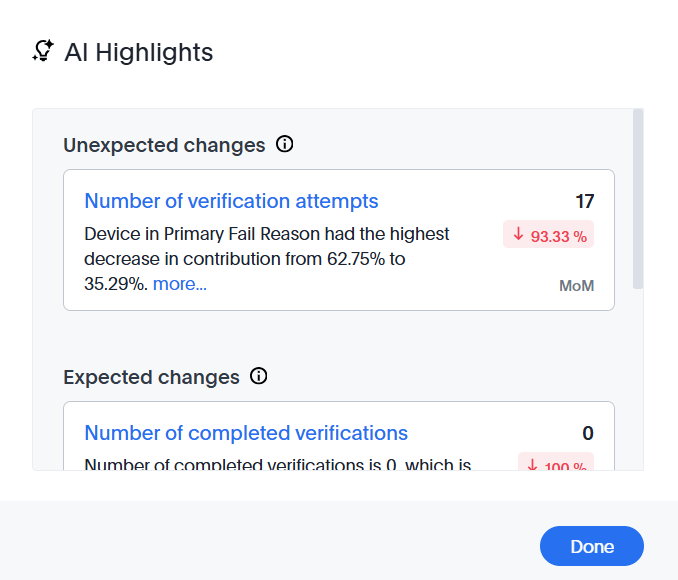
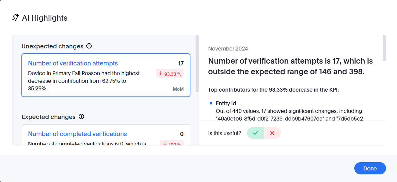
Generate highlights
Select AI Highlights to generate AI-powered highlights from the data. Select View to open the highlights and select any item to see more detail.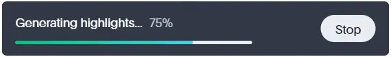
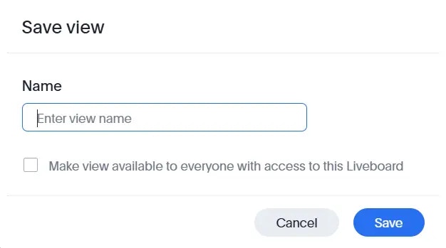
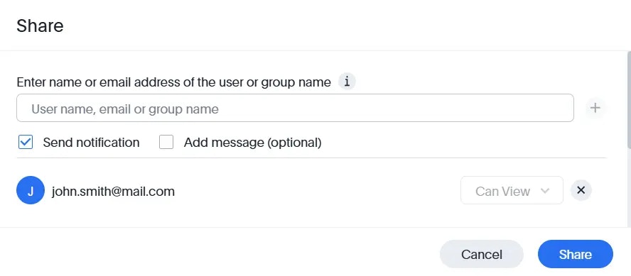
Share the Liveboard
Liveboard sharing is a premium feature. Email thoughtspot@frankieone.com if you’re interested in registering for our premium offering.

Save favorites
Select the star icon to add the current dashboard to your favorites. Select it again to remove it.Additional actions
Select the action menu (three dots icon) to access additional capabilities for the Analytics page.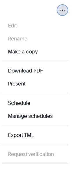
Key considerations
- All data set timestamps are in UTC. The Portal’s Entities tab displays time in your local browser time zone.
- The Individual tab uses the Latest Entity Data Asset, filtered on individuals only. Government ID checks use the ID Checks Data Asset as a secondary data asset.
- The Organization tab uses the Latest Entity Data Asset, filtered on Focus Organizations, Discovered Organizations, and Discovered Individuals. KYB transactional billing data is used as a secondary data asset.
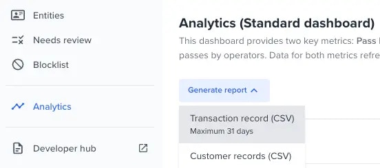
- The Generate report capability is available for both the Individual and Organization tabs. Transaction and customer record extracts are available for download.