{ title: { label: "Review your Information" }, cta: { label: "Submit your data" }, verify: true // Enable automatic verification logo: { src: './assets/logo.png' // path to your logo }, style: { 'ff-logo': { 'width': '50px' } }}
Advanced Configuration
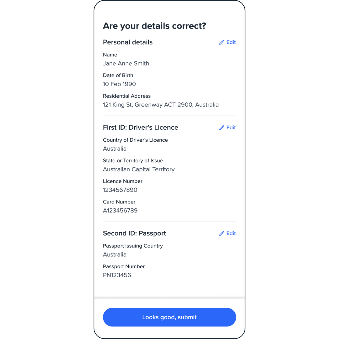
By default, the Review screen only shows submitted form details. To display specific details before submission, pass personal or documents configurations. These settings affect both review and edit screens.
The personal and documents configs follow the same structure as their
respective modules. See the Personal Details and
Document Upload module documentation for details.
Passing Personal and Documents Config
{ name: "REVIEW", type: "manual", personal: { /* Personal details config — see Personal Details module */ }, documents: { /* Document details config — see Document Upload module */ }}
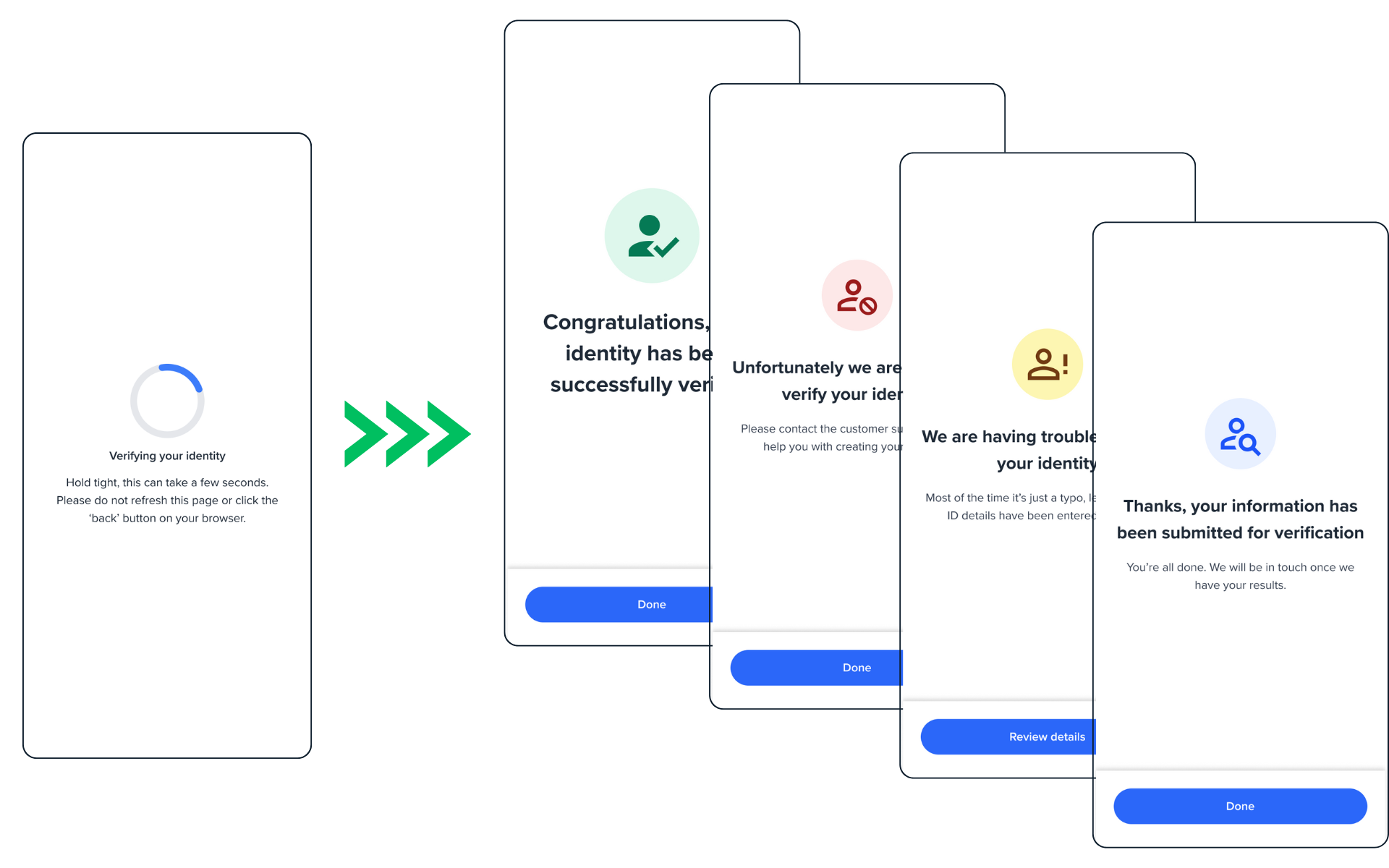
To customize the result screen, set customResult: true to prevent default screens from mounting. Then handle these events to show your own screens:
form:review:success
form:review:failed
form:review:partial
form:review:pending
// Initialize review component with custom result handling enabledconst review = oneSdk.component("form", { name: "REVIEW", type: "manual", customResult: true // Prevents default result screens from mounting verify: true // Custom result only applies for verify: true});// Create success screen component to show after successful verificationconst success = oneSdk.component("form", { name: "RESULT", state: "SUCCESS", title: { label: "Complete" }, descriptions: [{ label: "Process is now complete. You can close the page" }], creditHeaderIssueTitle: { label: "Customized Credit Header Issue Title for Success", style: { "ff-note-title": { // Add style for credit header title }, }, }, creditHeaderIssueDescriptions: [ { label: "Customized Credit Header Issue Descriptions Lorem Ipsum Dolor Sit Amet Consectetur Adipiscing Elit. Aliquam Eget Diam Eu Arcu", }, ], style: { "ff-note-description": { // Add style for credit header description }, },});// Create fail screen component to show after failed verificationconst failed = oneSdk.component("form", { name: "RESULT", state: "FAILED", title: { label: "Failed" }, descriptions: [{ label: "Process is failed. Please try again." }], creditHeaderIssueTitle: { label: "Customized Credit Header Issue Title for Failure", }, creditHeaderIssueDescriptions: [ { label: "Customized Credit Header Issue Descriptions Lorem Ipsum Dolor Sit Amet Consectetur Adipiscing Elit. Aliquam Eget Diam Eu Arcu", }, { label: "Another row of text here" }, ],});// Create partial screen component to show after partially failed verificationconst partial = oneSdk.component("form", { name: "RESULT", state: "PARTIAL", title: { label: "Unable to Verify" }, descriptions: [{ label: "Please check the information that you've entered and try again." }], creditHeaderIssueTitle: { label: "Customized Credit Header Issue Title for Partial Failure", }, creditHeaderIssueDescriptions: [ { label: "Customized Credit Header Issue Descriptions Lorem Ipsum Dolor Sit Amet Consectetur Adipiscing Elit. Aliquam Eget Diam Eu Arcu", }, { label: "Another row of text here" }, ],});// Listen for successful verification and mount success screenreview.on('form:review:success', () => { success.mount("#form"); // Mount success component in place of review screen});// Listen for failed verification and mount failed screenreview.on('form:review:failed', () => { failed.mount("#form"); // Mount failed component in place of review screen});// Listen for partial verification and mount partial screenreview.on('form:review:partial', () => { partial.mount("#form"); // Mount partial component in place of review screen});
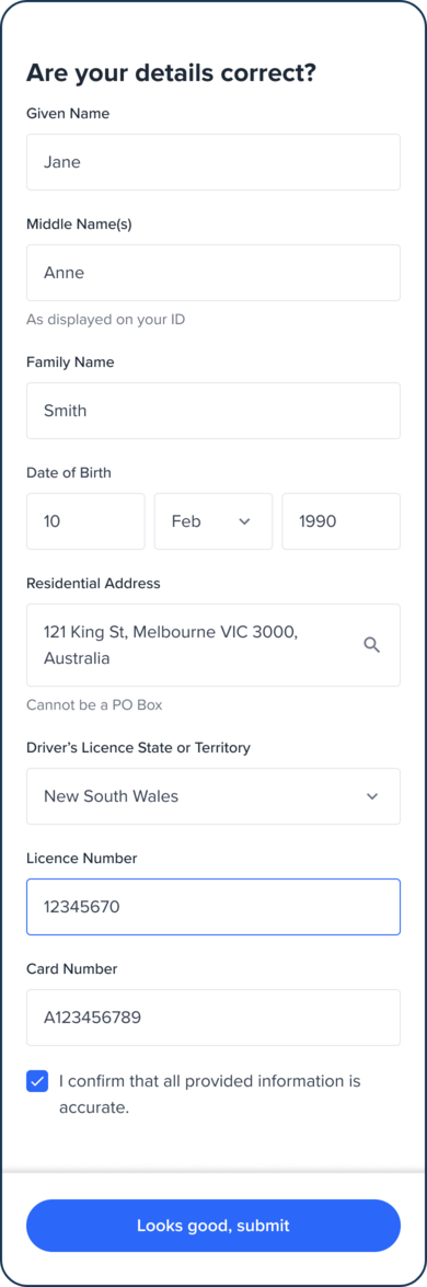
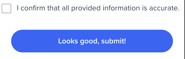
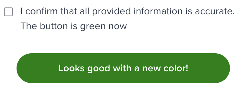
To change checkbox text and button, we can override instruction and cta properties, for example:
    const reviewOcr = oneSdk.component('form', {
      name: 'REVIEW',
      type: 'ocr',
      verify: true,
      instruction: {
        content: [
          {
            label: 'I confirm that all provided information is accurate. The button is green now'
          }
        ]
      },
      cta: {
        label: 'Looks good with a new color!',
        style: {
          "ff-button": {
            "backgroundColor": "green"
          }
        }
      }
    });
To handle network failures during review screen submission, OneSDK gives the opportunity to retry submissions up to three times, with clear error messages guiding them through network issues, ensuring a smoother and more transparent user experience.To change properties of retry mechanism, you can override cta property by:
where:retryAmount: number of retry user can have, default is 3timeoutRetryMiliseconds: number of miliseconds until retry button is clickable again, default is 3000retryAttemptString: a string shown under Submit button to guide your user to retry, default is “Error submitting form. Give it a moment to retry.”maxRetryAttemptedString: a string shown under Submit button where user has tried more than retryAmount, default is “Something went wrong, please contact customer service or try again in a few moments.”